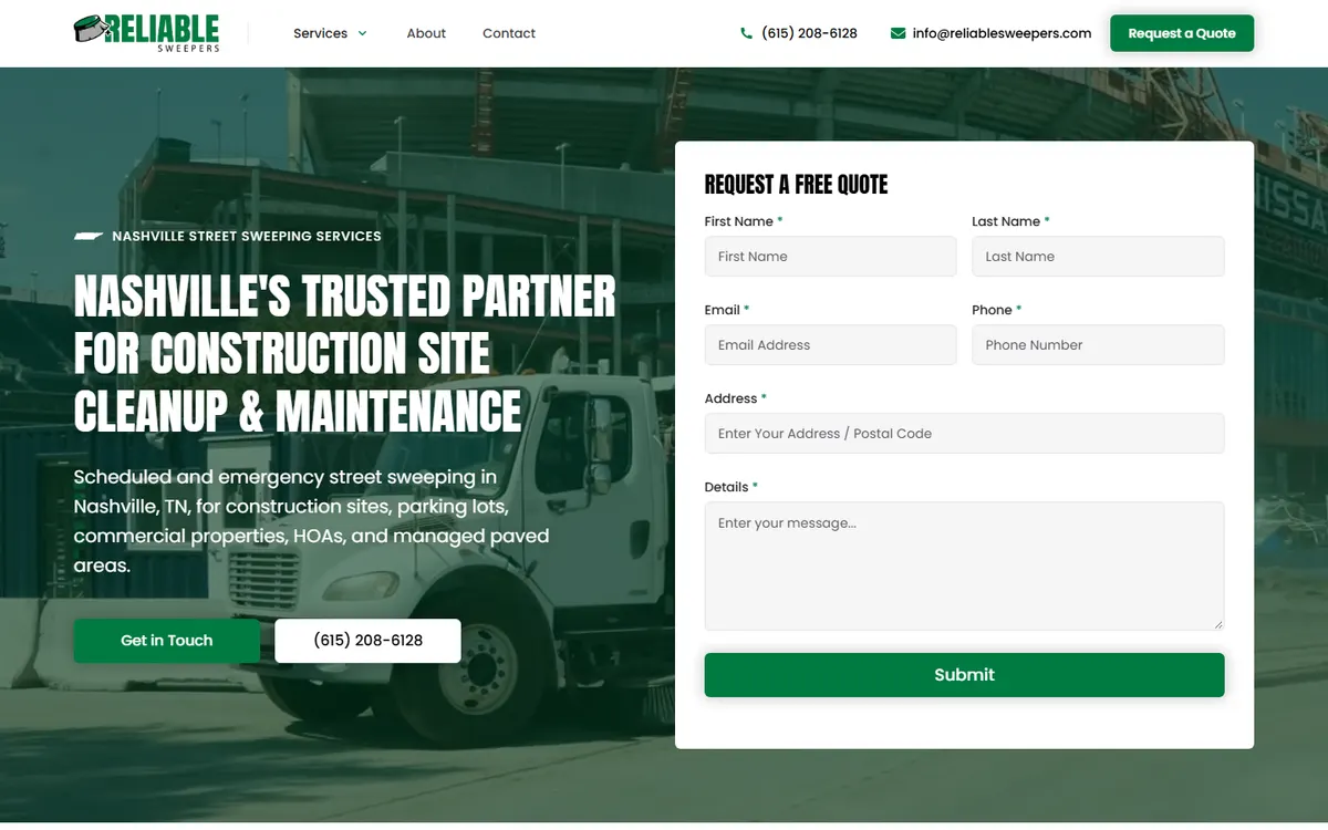
Picture your website as the digital storefront of your business. It’s often the first impression potential clients have, and in some cases, it's the deciding factor in whether they ever contact you. Yet, as someone who’s been designing and consulting with brands for years, I’ve noticed that while many businesses obsess over the aesthetic of their websites, they rarely think deeply about conversion — what truly makes a visitor take that next step. In today’s online space, “pretty” is easy. Webflow, Squarespace, and Wix have made design accessible to anyone. But building a high-converting website? That’s both an art and a science. It takes data, psychology, empathy, and a clear message working together in harmony.
In this article, we’re going to walk through the essential elements of a high-converting website — not just from the perspective of pixels and code, but from the lens of human behavior, business strategy, and storytelling. Whether you’re designing your own site, working with a designer, or auditing your current setup, these principles will give you a clearer understanding of what truly influences conversion. Let’s explore these elements in depth.
1. Clear Purpose and Messaging
One of the biggest reasons websites fail to convert is because their purpose isn’t immediately clear. You have a few seconds to answer the visitor’s subconscious question: “Am I in the right place?” The moment someone lands on your homepage, they should instantly understand who you are, what you do, and who you help.
Defining Clarity
I once worked with a local wellness clinic whose homepage headline said something vague like “Transforming Lives Through Holistic Health.” That sounds nice, but no one could tell if they were a chiropractor, a nutritionist, or a life coach. We changed it to “Chiropractic and Wellness Care in Franklin, TN — Helping You Move Without Pain.” Conversions increased by 37% within two months. It wasn’t because of a flashy new layout; it was because the message finally matched the user’s intent.
Actionable Tip
- Use the “grunt test” coined by Donald Miller in StoryBrand: if a caveman looked at your site, would he be able to grunt what you offer within five seconds?
- Keep headlines simple and benefit-driven. Avoid jargon unless your audience is highly technical and expects it.
- Ensure your unique value proposition appears above the fold — before someone scrolls.
A clear message sets the foundation. Without it, all the elegant animations or sleek UI patterns in the world can’t save user confusion.
2. Strategic Design and Layout
Good design doesn’t just look good — it guides the user’s behavior. When I design in Webflow or WordPress, I treat every visual choice like a directional cue. Where someone’s eyes go next is never left to chance.
The Psychology Behind Layout
According to a 2018 study by the Nielsen Norman Group (source), users typically scan web pages in an F-shaped pattern. They glance across the top, then skim down the left side. When you understand this, it changes how you design. Key information — headlines, CTAs, important offers — should follow this visual path to maximize engagement. This principle is the reason you see call-to-action buttons placed consistently at the top right or mid-page area.
Examples from Real Businesses
A client of mine who runs a boutique bakery had a gorgeous homepage — soft colors, beautiful photography. But her “Order Now” button was buried under two scrolls. When we simply moved it higher, styled it with a warm accent color, and gave it subtle hover animation, her online orders rose by 52%. Sometimes the smallest design shifts produce the biggest gains.
Practical Steps
- Limit color palette to 2–3 brand-consistent tones.
- Use whitespace intentionally; space equals clarity.
- Design mobile-first. Over 60% of traffic comes from mobile according to Statista.
- Test your calls to action across different screen sizes and user paths.
When your site’s design aligns with how users naturally think and move, the site becomes intuitive, and conversion feels almost effortless.
3. Emotional Storytelling and Social Proof
People don’t buy based on logic alone; they buy because of emotion validated by logic. This is where storytelling and social proof intertwine beautifully. Story gives your brand humanity, while proof gives it credibility.
Storytelling in Action
Think of your website as a series of conversations rather than a digital brochure. One of my clients, a financial planner, used to have an About page that listed credentials and certifications — impressive but sterile. We rewrote it to tell her story of growing up in a family business, learning firsthand how poor financial planning creates generational challenges. Now, her story isn’t just about trustworthiness; it’s about empathy. Prospects connect with her values before they even speak to her.
Leveraging Social Proof
Testimonials, case studies, and recognizable logos of partners build credibility quickly. A Webflow site I built for a home renovation company features a carousel of video testimonials. These human faces speaking directly to camera outperform written quotes tenfold. Visual proof resonates deeper than any written claim could.
Tips for Implementation
- Use case studies structured as transformation stories: Before, During, After.
- Include star ratings or client counts only if authentic. Today’s users recognize inflated metrics instantly.
- Feature testimonials close to related content. For example, a testimonial about your SEO results should sit near your description of SEO services.
Storytelling turns your business from a vendor into a partner. It reminds visitors there are real people behind the pixels.
4. Trust-Building and Credibility Signals
Conversion cannot exist without trust. If a user questions your legitimacy at any point, they’ll hesitate or abandon the journey altogether. Building trust online requires a layered approach that addresses both conscious and subconscious cues.
Visible Trust Indicators
Clear contact information, professional photography, client logos, and real team photos are some of the easiest ways to humanize your brand. Avoid using generic stock images of “business people shaking hands.” Users can spot these instantly. According to CXL research, real images of your office and team outperform stock imagery by notable margins in engagement tests.
Invisible Trust Builders
Security and functionality signals also matter. An SSL certificate, clear privacy policy, and reassuring checkout or contact experience give subtle reassurance. For businesses dealing in transactions, visible trust badges (like SSL or payment verification) can increase purchase intent by up to 42%, as shown in a study by the Baymard Institute (source).
Authenticity Case Study
One designer I mentored showcased high-end projects without showing any small-business work, unintentionally alienating half his audience. Once we added a few relatable stories from smaller clients, engagement time per page increased significantly. People trust what feels attainable and real, not just aspirational.
Trust builds gradually, through consistent visual language, real imagery, transparent copy, and smooth interactions. It’s not just technical, it’s emotional.
5. User Experience (UX) and Navigation
UX is more than usability; it’s empathy coded into functionality. It’s design that says, “I see you. I understand how you think.” When visitors can find what they need without effort, they’re subconsciously assured they’ll receive the same experience when they choose to work with you.
Mapping User Journeys
Imagine walking into a grocery store and the layout changes every time you visit. Stressful, right? The same happens on websites where buttons shift between pages or menu labels are unclear. Consistency creates comfort. When I design for clients in Webflow, I use heatmap data from Hotjar to analyze user behavior. By noticing where users drop off or hover, I make navigation tweaks that lead to immediate engagement lifts.
Accessibility and Inclusivity
An often overlooked part of UX is accessibility. Making your website accessible doesn’t just help those with disabilities — it improves usability for everyone. Adding alt text to images, proper heading hierarchy, and readable contrast ratios increases retention and SEO ranking alike. Google’s algorithm favors usability signals, according to Google Search Central.
Actionable Strategies
- Keep main navigation between 4–6 items max.
- Use breadcrumb trails for deeper content sections.
- Include a clear call to action on every page.
- Run quarterly UX audits to catch friction points.
Great UX is invisible. When people aren’t thinking about your design but about what they want to accomplish, you’ve nailed it.
6. Conversion Optimization and Call-to-Action Placement
Your calls to action (CTAs) are the tipping points between interest and action. A beautifully designed site with weak CTAs is like a store without a checkout counter. You can’t convert curiosity into commitment without clarity and motivation.
Crafting the Perfect CTA
A common issue I see is businesses either under-emphasizing or overreacting with CTAs. The trick is to balance assertiveness and empathy. One Webflow project we built for a coaching business previously used “Schedule a Call Now!” on every section — users felt pressured. We changed it to “Let’s Talk About Your Goals.” Engagement rose by 45%. The phrase shifted from command to conversation.
Testing and Iteration
In conversion optimization, there’s no finish line. A/B testing tools like Google Optimize or Convert let you test variations of headlines, copy, and button designs to see what converts best. The biggest gains often come from minor wording improvements rather than layout overhauls.
Placement Matters
Effective CTAs appear strategically throughout the journey — not just on the homepage. A contact button in the header, a lead magnet mid-article, and an inquiry section on the service page all play unique roles. Every CTA should answer “what’s next?” for the reader.
Key Tips
- Use action-driven language rooted in empathy (“Discover,” “Explore,” “Let’s Build”).
- Contrast buttons with brand palette for visibility.
- Test timing-triggered CTAs like exit-intent popups carefully — only when value-based, not intrusive.
A high-converting website doesn’t yell for attention; it invites conversation through friendly, logical progression.
7. Speed, Performance, and SEO Foundations
No one waits for a slow site. Page speed is both a user experience and an SEO factor. According to Google’s PageSpeed Insights, a 1-second delay in page load can reduce conversions by 7%. Yet many businesses overlook performance in pursuit of aesthetics.
Technical Performance
Optimized images, clean code, and reliable hosting contribute massively to speed. Platforms like Webflow inherently perform better than bloated WordPress builds filled with plugins. However, with proper development hygiene — lazy loading, caching, CDN integration — you can make any platform efficient.
SEO as Conversion Amplifier
Fast-loading, well-structured websites tend to rank higher, attracting more organic leads. But SEO also supports conversion indirectly. When visitors find your site easily and see it consistently at the top of search results, your perceived authority rises. According to Backlinko, signals like Core Web Vitals and mobile responsiveness now play major roles in rankings.
Practical Optimization Steps
- Compress images with tools like TinyPNG or Squoosh.
- Use minimalistic animation; too many Lottie files can slow performance.
- Implement structured data markup for clarity in search snippets.
- Regularly audit broken links and redirect outdated pages properly.
Performance is like the unseen framework of a well-built house: you don’t see it, but you feel its stability in everything you do.
8. Continuous Analysis and Iteration
The final element of a high-converting website is not a design component — it’s a mindset. No website should be static. Your audience evolves, algorithms shift, and technologies advance. The best-performing sites are living systems that respond to data, not assumptions.
Data-Driven Decision Making
Tools like Google Analytics 4 (source) help track metrics beyond surface-level vanity stats. Instead of obsessing over traffic, measure behavior flow and engagement depth. If users frequently stop before reaching the CTA, that’s a signal to revise your copy or layout.
Client Story: From Guessing to Growing
A local contractor I worked with felt his site “wasn’t working” but couldn’t explain why. We installed heatmap tracking and found that 60% of users quit right before filling out the form because the final step asked for too much personal detail. We simplified the form fields from eight to four. Lead submissions nearly doubled. That’s the power of ongoing iteration — small, data-informed tweaks over random overhauls.
Action Steps
- Review analytics monthly.
- Run quarterly UX and SEO audits.
- Regularly update testimonials and portfolio examples.
- Set conversion benchmarks and test one variable at a time.
A high-converting website isn’t built once; it’s refined continuously. Every bit of user feedback is an opportunity to improve alignment between message and audience.
Conclusion
When you step back and view your website holistically, you realize conversion doesn’t hinge on one flashy feature or trendy design technique. It’s the cumulative effect of clarity, empathy, psychology, performance, and trust. As someone who’s sat with countless business owners trying to “fix” their websites, I can tell you: most don’t need a rebuild. They need a reframe — to think about their site as a conversation rather than a presentation.
Clear messaging assures visitors they’re in the right place. Strategic design and layout guide them intuitively. Storytelling and social proof connect them emotionally. Trust signals make them feel safe. Strong UX keeps their journey smooth. Thoughtful CTAs invite them to act. Performance ensures they stick around. And data-driven iteration ensures your site grows alongside your business. That’s what truly defines a high-converting website.
In the end, conversion is just another word for connection. When your website mirrors the understanding, empathy, and strategic thinking behind your brand, conversion happens naturally — not by force, but by trust. That’s the difference between a website that talks at people and one that speaks with them.