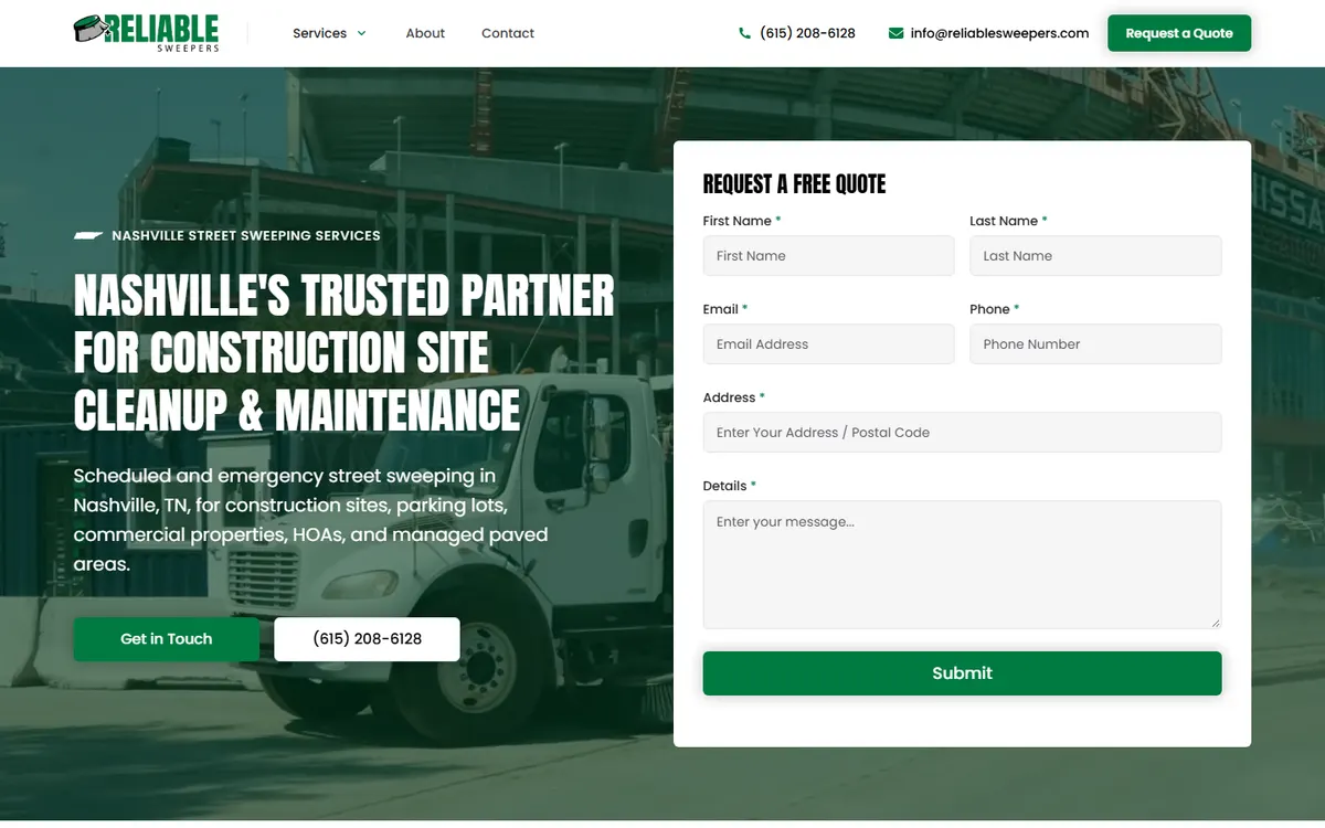
Improving your website’s conversion rate isn’t about flashier design or stuffing calls-to-action everywhere. It’s about deep understanding. When a potential client lands on your site, they aren’t consciously evaluating your color palette or font hierarchy—they’re subconsciously asking: “Can I trust this person to deliver what I need?” That split-second judgment decides whether they click, call, or leave. In this post, I’ll walk you through 8 practical steps to improving your website’s conversion rate with empathy, science, and the clarity that comes from truly understanding your audience.
Step 1: Begin with Understanding—Know Who You’re Designing For
Before touching a single pixel or crafting your next headline, you need to know your audience better than they know themselves. But I don’t mean the generic “identify your target market” exercise you’ve read about elsewhere. I mean really listening. What are their fears? What pressures are they under? If your site doesn’t speak to those emotions, no clever design will make up for it.
Think of it like renovating a home. Before picking out paint colors, you’d want to know who’s living there. Are they a busy family of five or a minimalist couple? The same logic applies online. A client once came to me with a beautiful but underperforming site built on Squarespace. It was sleek, full of abstract imagery, and had clever taglines—but their audience was local landscaping contractors. The tone missed completely. After interviewing the actual users, we discovered they valued clarity and credibility over aesthetics. We rebuilt the messaging in plain, confident language and included images of real projects. Conversions doubled within three months.
Solid research methods include:
- Conducting 5-10 customer interviews to identify pain points
- Monitoring live chat transcripts for repeated questions
- Reviewing analytics (bounce rates, exit pages, user flow)
- Creating empathy maps to visualize customer motivations
As Nielsen Norman Group emphasizes, even a handful of qualitative sessions often provides enough insight to pivot an entire strategy. Understand before you act. It’s the foundation for all the following steps.
Step 2: Simplify the Path—Refining User Experience
Once you understand your audience, simplify their path to conversion. Every extra click or confusing bit of copy introduces friction. There’s a golden rule here: if visitors have to stop and think about what to do next, you’ve lost them.
I sometimes describe websites as grocery stores. If you walk into a well-designed store, you instinctively know where to find what you need. Fresh produce on one side, checkout clearly marked. A poor website design is like walking into an endless maze of aisles without labels. Compare this to a project I did for a Nashville-based fitness coach moving from Wix to Webflow. Her old site buried the booking button under layers of storytelling and program descriptions. After restructuring the navigation and adding a floating “book your free session” button, sign-ups increased by 140% over two months.
Declutter Navigation
Audit your menu. Limit primary navigation to 5-6 key items. Use descriptive labels (“Our Work,” “Services,” “Contact”) rather than clever metaphors. According to a HubSpot study, 76% of consumers say the most important website factor is ease of use.
Focus Each Page on One Goal
A landing page shouldn’t try to be everything to everyone. Each page should exist for a single purpose, whether it’s to capture leads, sell a product, or schedule a consultation. This makes copywriting simpler and analytics cleaner too.
Step 3: Build Trust Through Design
Design has psychology baked into it. Certain layouts, colors, and micro-interactions signal trustworthiness. For service providers—especially in saturated markets like web design—visual trust signals are your silent sales team. In a Webflow project for a local dentist in Franklin, Tennessee, we replaced stock photos with real staff photos, added video testimonials, and redesigned the contact form for a friendlier tone. Bookings rose, but more importantly, the average lead quality improved. They were getting people who were already sold on the feeling of professionalism and approachability the design projected.
Consistency Is Confidence
Make sure fonts, colors, and buttons behave consistently. Visual consistency gives users subconscious clues that your business is competent. It’s like walking into a clean restaurant—you immediately feel more comfortable eating there.
Show Real Proof
Include authentic client photos, quotes, and data. A 2024 BrightLocal survey found that 87% of consumers used Google reviews to evaluate local businesses last year. Integrating those proofs on-site minimizes friction. Let people see others have trusted you first.
Step 4: Optimize for Speed and Performance
Speed isn’t just about better SEO rankings—it’s about respect for your users’ time. The difference between a page loading in 1.5 seconds and 3.5 seconds can determine whether people stay or bounce. Google’s PageSpeed Insights suggests three seconds as the upper limit before perception of slowness sets in.
I once worked with a boutique e-commerce brand on WordPress suffering 8-second load times because of bloated plugins and oversized hero videos. After switching to optimized WebP images, implementing a caching plugin, and hosting on a performance-oriented service, load times dropped to 1.8 seconds. Conversion rates went up 60% in weeks—with zero design changes.
Technical Actions to Improve Speed
- Compress images before upload using tools like TinyPNG
- Remove unnecessary plugins or scripts
- Implement browser caching and a CDN
- Optimize font usage—limit weights and variants
In Webflow, this is typically easier to manage since the platform minifies code automatically. In WordPress or Wix, however, regular audits are critical. Clients often tell me they want a “fast website,” but I remind them: fast is relative to how quickly users get what they need. That’s performance in its truest sense.
Step 5: Write Copy That Converts
The best copy is conversational and customer-centered. Most businesses write about themselves (“our history, our process, our services”) when visitors only care about what’s in it for them. Empathy again becomes your best conversion tool.
When redesigning a local spa’s website, I noticed every headline began with “We Offer.” I shifted that to direct benefits—“Relax with customized treatments made for your stress type.” The change was subtle, but website inquiries grew by 70% without expanding advertising spend.
The Power of the First Screen
Your hero section should answer three questions instantly:
- What do you do?
- Who is it for?
- Why should I care?
If a visitor can’t answer those by glancing for five seconds, rewrite it. According to CXL research, clarity beats persuasion every time. Don’t try to be clever; try to be clear.
Microcopy Matters
Pay attention to small pieces of text—button labels, form field placeholders, error messages. Rewriting “Submit” to “Get My Free Quote” can humanize your experience and subtly remind users of the value exchange happening.
Step 6: Strengthen Calls-to-Action
A page without a compelling CTA is like a conversation that trails off mid-sentence. Every visitor needs to know what to do next. This doesn’t mean bombarding them with bright buttons—it’s about psychological momentum.
In a project with a real estate photographer, we tested two CTAs: “Book Now” versus “Let’s Plan Your Shoot.” The second version increased form completions by 30%, purely because it felt more collaborative. It invited action rather than demanded it.
Placement and Frequency
CTAs should appear at logical intervals, not just at the bottom. Place them after key credibility sections, such as testimonials or service breakdowns. Multiple smaller nudges outperform one giant plea. Try integrating scroll-triggered CTAs that quietly appear when engagement peaks.
Match Copy to Intent
Your CTA language should align with the user’s temperature. Cold visitors shouldn’t be pushed to “Buy Now.” Offer a free consultation or resource first. Warm leads can be invited to schedule a call. That gradual path mirrors how trust builds in human relationships.
Step 7: Leverage Analytics and Split Testing
You can’t improve what you don’t measure. Data tells the story behind behavior, but only if you listen carefully. In my consulting, I often see business owners relying solely on Google Analytics without defining clear metrics. That’s like checking your car dashboard but never looking at which light is blinking.
Start by identifying true conversion indicators. For a service business, it might be form submissions or time on key service pages. For e-commerce, it’s cart completions. Once those are clear, track them consistently. Implement split testing tools like Google Optimize (free) or Optimizely for more advanced insights.
We once ran an A/B test for a Nashville-based construction company. Their form asked for ten fields, including “project details” and “ideal timeline.” We simplified it to three essential fields: name, email, and brief description. Conversions increased by 115%. The lesson? Don’t make users work harder than necessary before you’ve earned their commitment.
Setting Up Goals and Heatmaps
- Define one primary goal per page in Google Analytics
- Use tools like Hotjar or Microsoft Clarity to visualize how users engage
- Identify rage clicks or confusion points
When you see where users hesitate, you can empathize better and remove invisible barriers. The key is to iterate. Optimization is less a one-time sprint and more a recurring conversation with your audience.
Step 8: Craft an Emotionally Resonant Story
At the end of the day, people make buying decisions emotionally and justify them rationally. Your website should reflect that duality. Storytelling binds those two together. As Donald Miller’s StoryBrand framework highlights, successful websites position the client as the hero and your business as the guide. It’s not about you—it’s about helping them overcome their challenge.
A powerful example came from a brand strategy project for a local nonprofit. Their old site overwhelmed visitors with statistics about their success. After reframing around a single story—one family impacted by their services—donation conversions climbed by 40%. Humans connect to humans, not data points.
How to Integrate Narrative into Design
- Begin your homepage with a relatable scenario
- Use consistent voice and imagery across all touchpoints
- Close each page with a resolution: what transformation awaits the user
Even in something as seemingly dry as SEO consulting, story helps. When I coach small businesses, I position SEO as “helping Google understand who you really are so clients can find you.” That metaphor sticks better than explaining algorithm updates. Connection drives comprehension.
Conclusion: Conversion Growth as a Reflection of Connection
Improving your website’s conversion rate isn’t just about tweaking buttons or running performance audits—it’s about empathy translated into design. When your website mirrors how your audience thinks, speaks, and feels, conversion becomes a byproduct of connection. These eight steps—understanding your users, improving navigation, building trust, optimizing speed, crafting clear copy, strengthening CTAs, analyzing data, and embedding story—all fit together as parts of that larger human-centered approach.
As you evaluate your own site, look beyond the metrics for a moment. Ask yourself: does this space feel like a conversation I’d want to have? If you can confidently say “yes,” your conversion rate will show it. The future of web design isn’t just technical—it’s psychological, relational, and deeply personal. Every pixel and paragraph can either build trust or drain it. Choose to build.