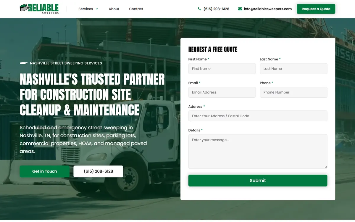

In the past few years, one design trend has reshaped how websites look, feel, and function: minimalism. More than just an aesthetic shift, minimalism in web design has become a philosophy that influences user behavior, brand trust, and digital marketing results. At first glance, it may just seem like “less stuff on a page,” but as any designer will tell you, creating simplicity takes work. Businesses that understand the deeper side of minimalist design can leverage it to create sites that not only look sharp but also convert visitors into loyal customers. It’s not about stripping away personality or content—it’s about focusing attention where it matters most.
As someone who builds websites across platforms—from Webflow to Wordpress, Wix, and Squarespace—I’ve seen the minimalist wave transform client expectations. It’s especially interesting to see how this trend interacts with business psychology. The clean look of a site often changes how a visitor perceives the company’s credibility and professionalism. For local businesses, minimalism can communicate confidence and clarity, while also improving performance metrics like load speed and readability. But that only works when minimalism is applied intentionally and strategically. Done poorly, it can backfire and leave a site feeling unfinished or emotionally hollow.
This blog post will take a deep dive into understanding minimalist web design and how it affects your business—beyond the visuals. We’ll explore real-world examples, expert insights, and practical steps to use minimalism thoughtfully. I want to share the “why” behind this trend and how it connects to your customer’s psychology. It’s not about designing for design’s sake; it’s about clarity, conversion, and connection.
What Minimalism Really Means in Web Design
Minimalism is often misunderstood as simply removing content. But true minimalism in web design is about clarity of purpose. It’s a framework for prioritizing what matters most on a page. Every color, every line, every word must earn its place. When you think like a minimalist designer, the question shifts from “What can we add?” to “What do users truly need to achieve their goal?” That mindset is what separates a clean aesthetic from strategic simplicity.
In a practical sense, minimalist web design often features generous white space, limited color palettes, intentional use of typography, and high-quality imagery. But the magic of minimalism is in its restraint. It lets content breathe and encourages users to focus on key actions—whether scheduling a consultation, reading product details, or filling out a form. This isn’t just a stylistic choice; it’s an experience design principle rooted in centuries of visual communication theory.
The roots of minimalism stretch back to art and architecture movements like Bauhaus and Japanese Zen philosophy. Both emphasize balance, function, and focus. That influence carries into digital spaces. According to a study published in Stanford’s Web Credibility Project, clean website layouts with simple navigation systems tend to be perceived as more trustworthy than cluttered designs. So yes, less can literally mean more—more trust, more engagement, and more conversions.
The Psychology Behind “Less is More”
Humans process visual information almost instantly. When faced with too many options or visual noise, cognitive overload kicks in. That’s why minimalism helps: it reduces the mental friction between arriving on a page and taking action. Imagine walking into a showroom where every wall is covered in posters, text, and flashing signs—it’s exhausting. But a space with well-placed messages, white walls, and a clear focal point invites curiosity and movement.
For example, I once worked with a local dental clinic that had an overly complex website. Their homepage featured multiple scrolling banners, six categories in the main menu, and three separate contact forms. After a redesign guided by minimalist principles—fewer choices, clear CTAs, and more visual balance—the bounce rate dropped by 22%. Patients found information faster and booked appointments more easily. The team didn’t just get a new design—they got fewer missed opportunities.
Sectioning Out Simplicity: Core Elements of Minimalist Design
To practice minimalism effectively, it’s helpful to break the concept into core elements. Think of it as remodeling a house: you can’t tear down every wall and expect it to function. You need structure. For design, that structure comes in the form of typography, color, spacing, imagery, and content hierarchy.
Typography as the Silent Communicator
Minimalist websites often rely on typography to convey brand personality. When the visual field isn’t crowded, the subtleties of font choice and spacing take on new importance. A SaaS company might use bold sans-serif fonts to communicate innovation, while a boutique brand uses a delicate serif for elegance. Choosing two or three complementary fonts is usually ideal. Any more can begin to dilute the minimalist clarity.
A good example is Stripe. Their homepage balances whitespace with sharp typography that feels methodical, confident, and modern. There’s nothing flashy—yet the design feels powerful. Every headline guides the user downward, gently introducing the value proposition. The consistency in headings, line height, and spacing keeps focus on the copy, not on unnecessary visual flourishes.
Color and Contrast
In minimalist design, color becomes an intentional tool rather than decoration. Muted palettes with one accent color create visual harmony and purposeful contrast. Consider Apple’s use of white space contrasted with product images—this guides attention without distraction. Similarly, using one call-to-action color throughout the site helps users understand where to click.
For a local business, adopting a minimalist color system can signal refinement. A Nashville-based spa I consulted with reduced their website’s color palette from eight tones to three—a soft beige, white, and a muted green. The site immediately felt more coherent. Visitors described it as “calming,” and conversions increased for online bookings. The shift didn’t require fancy animations or new photography, just restraint.
Whitespace and Rhythm
Whitespace, or “negative space,” is not empty—it’s the invisible element that organizes everything else. It establishes rhythm, hierarchy, and calm. Think of whitespace as the pause between musical notes. Without it, design becomes noise. Too often, businesses fill pages with information, fearing blank space might appear wasted. But in reality, whitespace creates visual trust and makes the important elements stand out more.
Google’s homepage remains a benchmark example. Its simplicity—one logo, one search bar—is more than iconic; it’s strategic. The design conveys singular intent. Users know exactly what to do. That clarity is what every minimalist site aims to evoke, even when the business need is more complex than a search box.
Why Businesses Gravitate Toward Minimalism
From startups to long-standing local companies, everyone seems to want a “clean design” these days. But why? The answer often lies in evolving user expectations and business psychology. In a digital landscape saturated with content, simplicity cuts through the noise. A minimalist interface signals confidence—it says, “We know who we are, and we know what matters.” That’s powerful branding psychology.
Minimalism also aligns with performance-driven goals. Lightweight layouts load faster and perform better on mobile devices. According to Google data, pages that load in under three seconds have up to 50% longer average sessions than slower ones. So adopting minimalism can directly improve core web vitals, a key ranking factor. For SEO-conscious businesses, that’s not just aesthetic preference—it’s strategy.
Another reason businesses are drawn to minimalism is emotional resonance. When people encounter clarity, they feel reassured. In marketing, that calm and control fosters trust. In local contexts like Franklin, TN or small towns, approachable minimalism (not stark minimalism) works wonders. Clients often say it feels more “human” and honest. That’s the kind of psychological impact design should aim for.
Real-World Success Stories: Minimalism in Action
Concepts are helpful, but let’s look at how minimalism plays out in real businesses.
Case Study 1: A Local Coffee Shop Rebrand
A Franklin-based coffee shop had a dated Wordpress site with lots of textures, overlapping fonts, and a dark color scheme. It looked “full,” but didn’t convert. We rebuilt the site using Webflow, stripping away excess content and using warm white backgrounds with black text. One accent hue—a deep coffee brown—became their CTA color. Navigation went from seven links to four. After launch, their online order traffic doubled within two months. Regulars said the new site felt “clean but cozy.”
Case Study 2: A B2B SaaS Platform
For a SaaS company offering CRM software, minimalism played a different role. We created a single linear homepage with concise headlines and strong typographic hierarchy. White space and large explainer text guided the eye naturally downward. Unlike their previous “busy” design, this layout gave prospects fewer chances to abandon the page. Analytics later showed an increase of 30% in demo requests. The design wasn’t showy; it was strategic.
Case Study 3: Personal Branding Site
An entrepreneur I worked with wanted a website that reflected her values as a coach and speaker. Initially, her design was colorful and eclectic, trying to communicate her enthusiasm. However, her message got lost. By applying minimalist structure—soft neutral backgrounds, one accent color, and clear typography—her story took center stage. Clients connected with her clarity and confidence, not just her personality. Sometimes restraint amplifies authenticity.
SEO and Minimalism: A Symbiotic Relationship
There’s an important connection between minimalism and SEO. Google’s focus on user experience metrics means that fast load time, mobile-friendly layouts, and clarity of content impact rankings directly. Minimalism, if handled well, supports all three.
Speed and Performance Benefits
Minimalist designs reduce the number of scripts, image files, and heavy animations. This creates a leaner DOM structure, faster load times, and smoother interactions. I’ve seen Wordpress sites drop their page load from 4.2 seconds to under 2 simply by simplifying layout and consolidating plugins. That might seem small, but according to Neil Patel’s research, a one-second delay in page load can lead to a 7% reduction in conversions. Minimalist design combats that.
Content Hierarchy and Crawl Clarity
When minimalism forces clear structure, search engines benefit too. Well-defined H2 and H3 structures, fewer distractions, and strategic keyword placement help crawlers understand content relevance faster. Google doesn’t reward design visuals directly, but it rewards organization. A minimalist approach encourages exactly that.
Reduced Bounce Rates Through Simplicity
Reducing cognitive load not only engages users but also reduces bounce rates—an indirect SEO signal. A clear interface guides users toward the action they came for. They spend longer on-site, click deeper, and are more likely to return. This engagement loop feeds both algorithmic visibility and customer trust.
The Risks and Misconceptions of Minimalism
Before everyone starts deleting content, it’s important to understand that minimalism has pitfalls when misunderstood. It’s not about emptying your site; it’s about balancing purpose with simplicity. When businesses oversimplify, they often remove context crucial to persuasion. A minimal design must still communicate value.
I’ve seen brands misapply minimalism to the point where visitors couldn’t tell what the company offered. One small agency removed almost all text to “keep it clean,” but users left without understanding their service. Their conversion rate halved. We reintroduced copy in key sections while maintaining visual simplicity, and their results rebounded.
Minimalism also doesn’t suit every brand equally. For example, an e-commerce store with hundreds of SKUs may need more visible navigation and product details. The trick is to find “strategic minimalism”—clean where it counts, detailed where it matters. Done right, you can achieve simplicity without sacrificing richness.
Practical Tips for Businesses Embracing Minimalism
Adopting minimalist design takes planning and intentionality. Here are actionable steps to approach it wisely.
1. Audit Before You Edit
Start by examining your current website through your customer’s eyes. Ask: What are the three most common actions people take here? Anything that doesn’t help those should be reconsidered. This exercise often reveals redundant menus, buttons, and text blocks. Trim gently, not recklessly.
2. Use White Space Strategically
Whitespace is design’s version of breathing room. Don’t fear it. In practice, aim for generous padding and margins, especially around CTAs and key content sections. This helps users process information quickly. Tools like UX Collective show examples of how spacing improves readability.
3. Focus on One Action Per Screen
Each page section should lead users toward one specific action, especially on mobile. That could be “Learn More,” “Contact Us,” or “Book Now.” Avoid offering multiple competing paths in a single viewport. Simplicity drives decision-making.
4. Prioritize Performance
Compress imagery, use lightweight fonts, and eliminate unused code. Platforms like Webflow make this easier thanks to built-in optimization. But even on Wordpress, use tools like WP Rocket or TinyPNG. The technical side of minimalism underpins its visual success.
5. Maintain Emotional Warmth
Minimalism shouldn’t be cold. Incorporate human elements like authentic photography, conversational copy, and touches of texture. Visitors should still feel that someone cared about their experience. The difference between sterile and spacious often lies in tone and imagery choices.
Minimalism as a Long-Term Strategy
Minimalism, when done well, evolves with your business. It’s easier to update, scale, and adapt. A well-structured minimalist foundation makes future design evolution seamless. When you add new products, services, or campaigns, they can integrate naturally without overwhelming users.
As design trends ebb and flow, minimalism tends to have the longest shelf life. Flashy elements may come and go, but clarity never goes out of style. In that way, minimalism isn’t trendy at all—it’s timeless. It aligns with human psychology, business efficiency, and sustainable design thinking. As your brand matures, your minimalist structure can grow with small refinements instead of major overhauls.
Conclusion
Minimalist web design is far more than a trend; it’s a philosophy rooted in communication, psychology, and user experience. By emphasizing clarity and intention, businesses can foster deeper trust and better performance. The beauty of minimalism lies in what it reveals, not what it hides. It spotlights your brand’s strengths without distractions, making visitors feel guided rather than sold to. Whether you’re building on Webflow, Wordpress, or another platform, the principles remain the same: focus attention, reduce friction, and connect authentically.
For businesses today, especially those balancing local presence with digital reach, understanding minimalism isn’t about following fashion—it’s about creating digital spaces that feel calm, credible, and confident. The modern user doesn’t just want information; they want ease. They want to feel like your website understands them. When you adopt a minimalist mindset, you design with empathy—and that’s where real connection begins.